
What Density shows
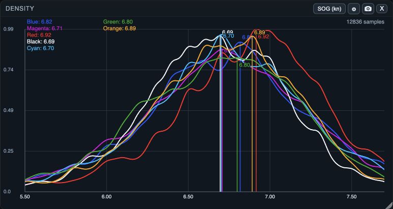
Density shows how often values occur in the selected interval. Each boat has a smoothed curve: the peak marks its most common values, and the width shows the spread. It uses the selected interval, not the whole log.
1. Select the value and interval
1. Open Density from Windows on web/desktop, or the workspace panels menu or Choose windows on native. 2. Choose the value button, which initially can show SOG. 3. Confirm a metric that is available for all boats you want to compare. 4. Set the same clean sailing interval in Time & Wind. 5. Check the curve labels and peaks, then compare questionable results in Table or Graph.
2. Tune the presentation without changing samples
1. Open Density settings. 2. Set Lower percentile and Upper percentile to focus the visible value range. 3. Adjust Smoothing only enough to make the pattern readable. 4. Leave Curve resolution on Auto unless you have a display-specific reason to choose Manual. 5. If using Manual, set Curve points and read the help before applying.
Curve points control drawing precision and calculation cost, not the underlying samples. Percentile crop changes the displayed portion of the distribution; it does not delete telemetry or rewrite the selected time range.
If the curve misleads or disappears
- No curve: confirm a boat is open, the selected time range contains the chosen metric, and the metric is valid for that data.
- A peak looks too certain: widen the range or compare sample coverage in Table and Graph.
- The useful area is cropped away: restore a wider percentile range.
- The curve is noisy or too flat: adjust Smoothing gradually, then compare with the raw values.
- Manual resolution makes no useful difference: return to Auto. It changes curve rendering precision and calculation cost, not the observations.
- An experimental settings draft is not helping: choose Cancel before OK to keep the previous committed Density settings.